Private Pension Products
Redesigning how a contact centre talks people out of cashing in their retirement savings — using behavioural science, and building the tool with the people who'd use it.
Service Designer | UX Designer
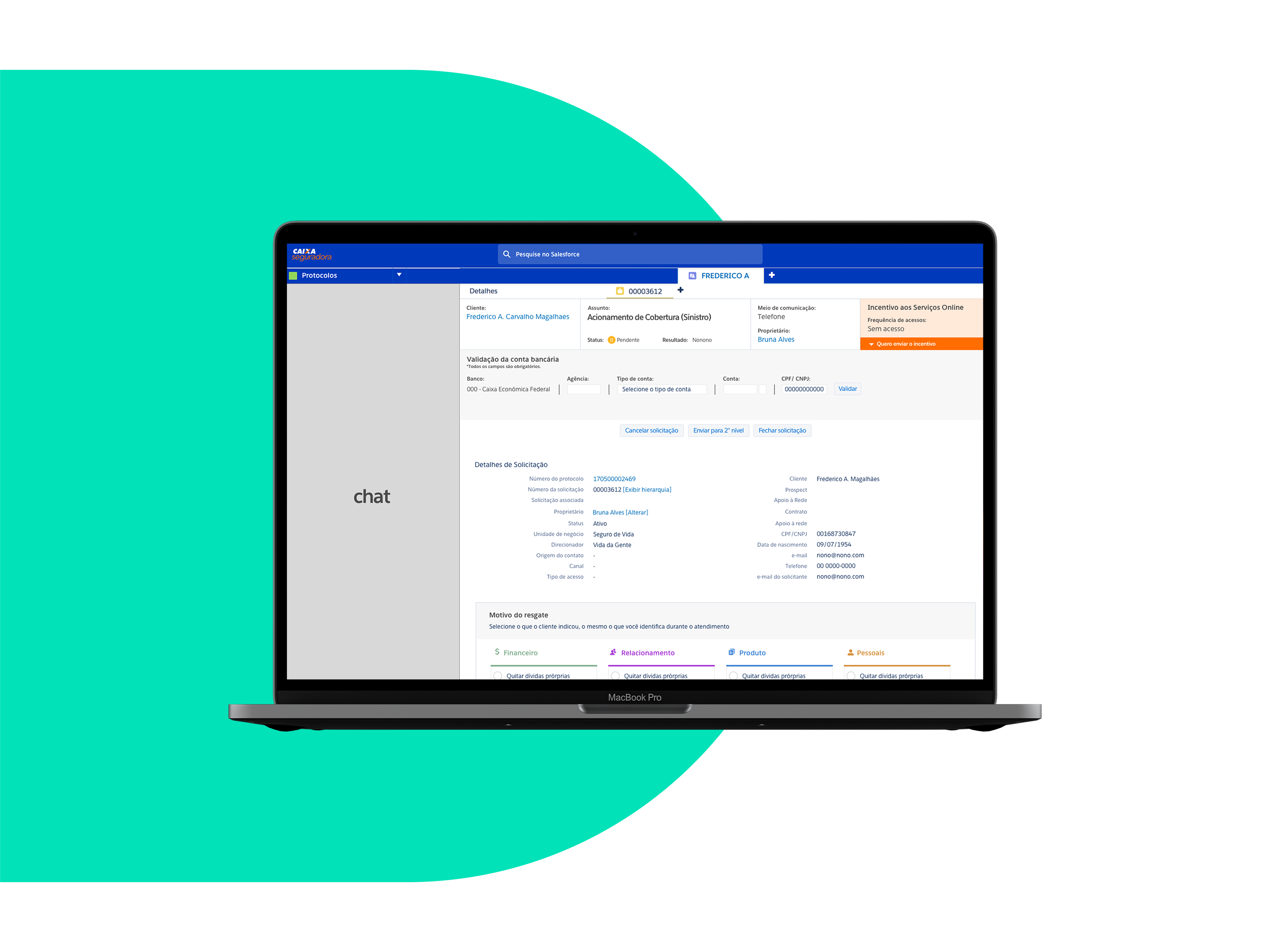
I led design on this project end to end: strategy and feature definition, user research, wireframes, and usability testing. I'd also run the original pilot that proved the concept a year earlier, so I came in knowing the problem intimately. Working alongside other UX/UI designers, I contributed to the visual design within Caixa Seguradora's brand guidelines and the technical limits of Salesforce.

Between 2017 and 2018, I ran a behavioural science experiment inside the private pension retention team at the contact centre. The idea was simple to describe and hard to execute: instead of scripting representatives to argue harder, script them to work with how people actually make financial decisions — loss aversion, present bias, framing.
The pilot worked — it worked so well that when Caixa Seguradora rolled out Salesforce CRM across all post-purchase operations, the question became: can we scale this properly?
That's what this project was — taking a proven experiment and building it into the daily tooling of an entire retention operation, for both the representatives using it and the clients on the other end of the call.
Every day, thousands of clients call in wanting to withdraw some or all of their private pension savings — yes, that's allowed in Brazil. By month's end, that adds up to millions of dollars leaving the company, and, more quietly, a lot of people damaging their own retirement to solve a short-term problem.
This is the project that changed how I think about research, and I still measure others against it.
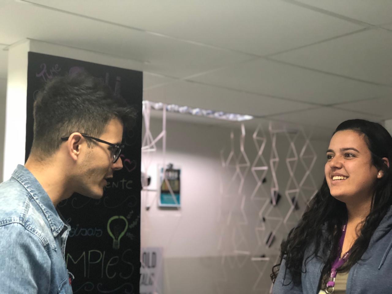
We didn't visit the contact centre — we moved in. A cross-functional team, we spent most of the project embedded on the floor, listening to live calls, watching representatives switch between systems, sitting in on their coaching sessions. The team included behavioural science expertise, with consulting support from InBehaviour Lab.
Proximity changed everything. When you're at the next desk, you don't schedule a research session to find out why someone sighs before opening a screen — you just ask. That gave us generative research before we'd defined anything, then evaluative research through interviews and usability testing once we had something to react to.
What I took from it: the closer you sit to the people doing the work, the less you have to guess.
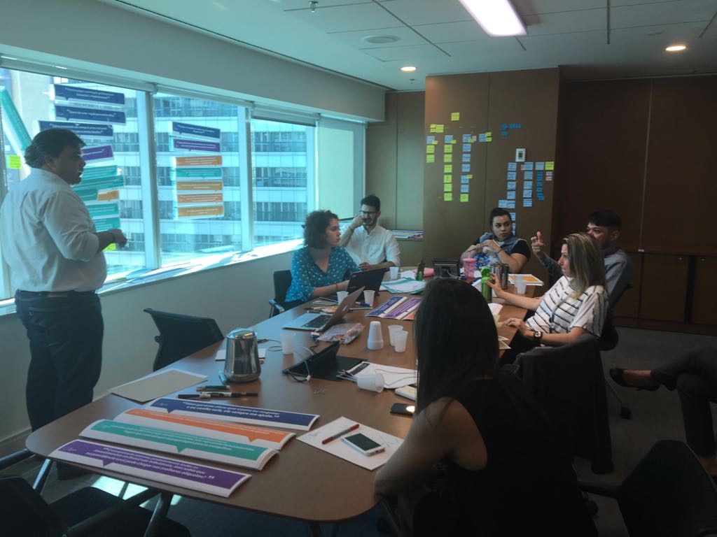
We ran a workshop we called the Design Lab — a compressed Design Sprint format, two days, with people pulled from across Caixa Seguradora. Mapping first, to get everyone onto shared ground, then sketching.
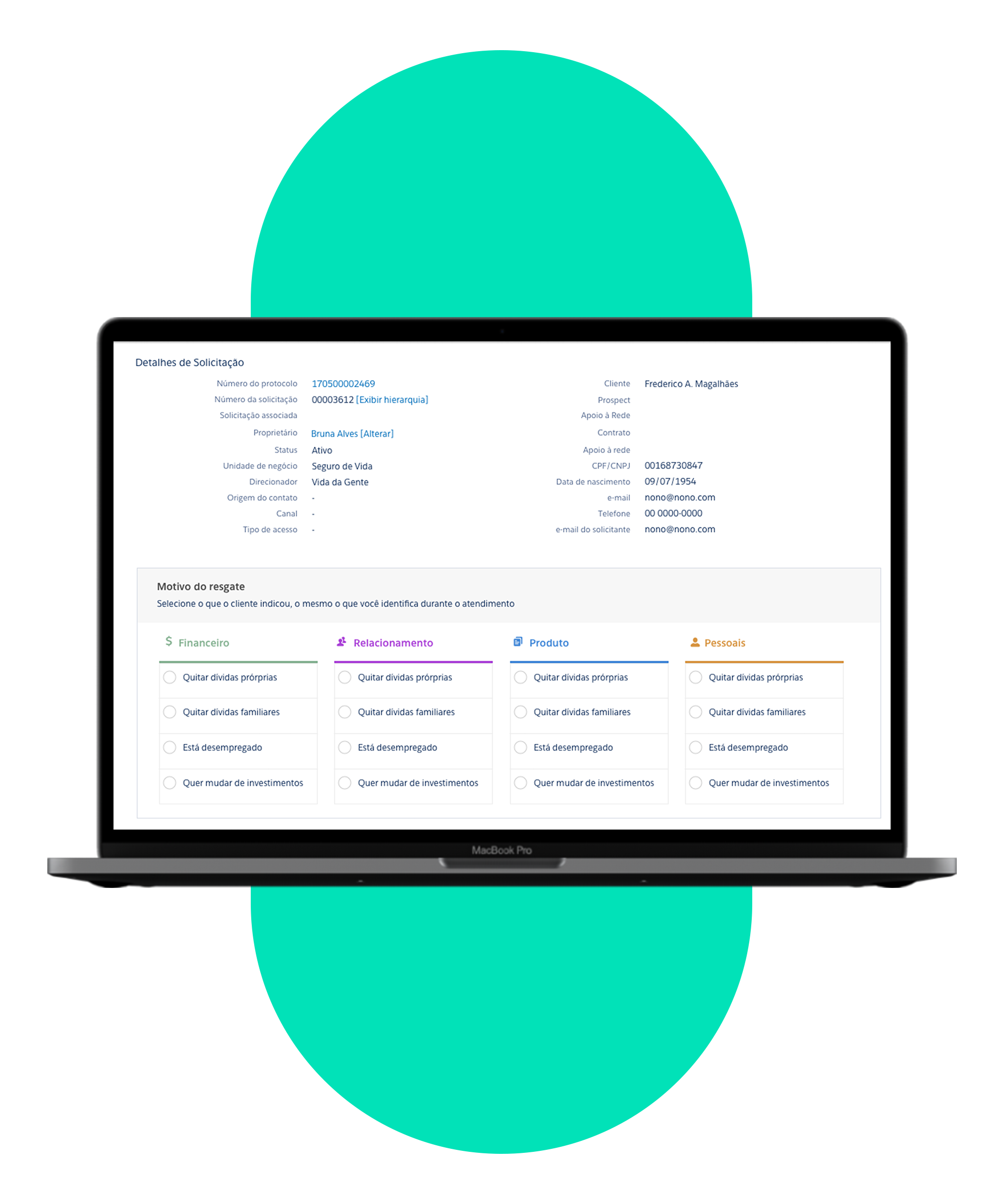
The Lab is where the whole mechanic of the new conversation came from. We identified four primary reasons clients withdraw their savings, each with four or five sub-reasons underneath. Then teams brainstormed the best arguments and strategies for each one.
We came out with over 300 raw inputs, later refined down to 135 arguments that made it into the final framework.
The critical part wasn't the volume. It was who was in the room: the representatives weren't research subjects sitting in a lab down the hall. They were building the thing with us.
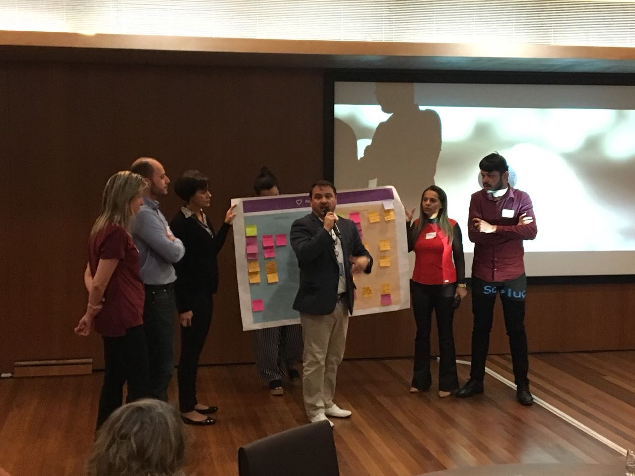
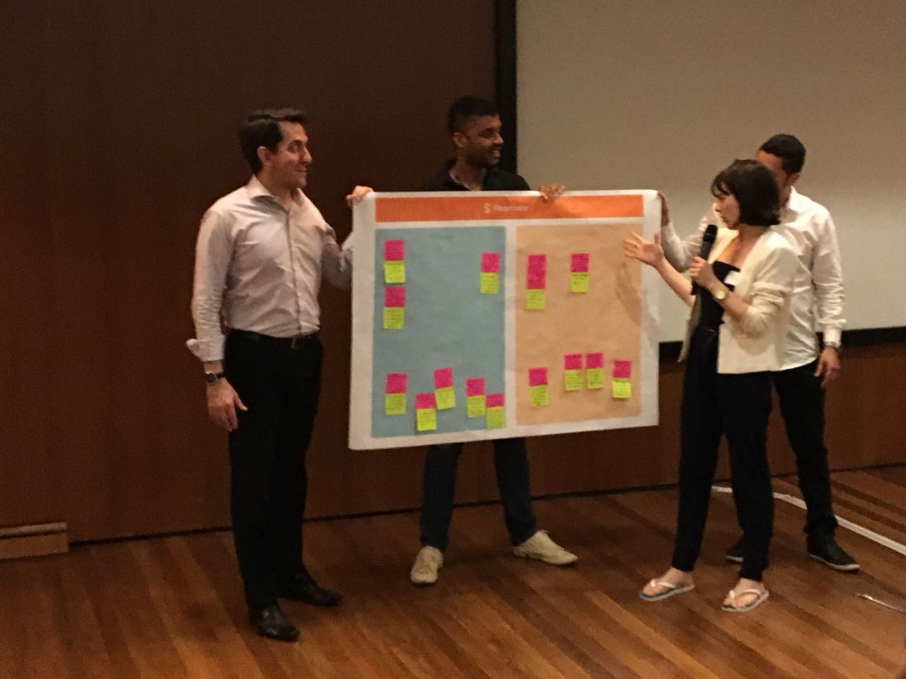
With interviews, research, and Lab outputs in hand, we moved to low-fidelity wireframes to make sure every necessary feature had a home.
We then prototyped in Bizagi — a business process modelling tool, and an unusual choice for design work, but a deliberate one. Remember; this was 2018, and the constraint wasn't fidelity, it was access. The contact centre ran on a wide spread of machines, browser versions and network conditions, and there were a lot of them. A prototype in InVision or Axure would have run beautifully on my (Mac) laptop and badly on half the floor — which would have meant testing with the people who happened to have good hardware, and scaling to everyone else on faith.
Bizagi ran inside the CRM environment the representatives already used, on the equipment they already had. That let us test the flow in something close to real conditions rather than a design-tool simulation, and get it in front of a lot of people quickly. We tested with users for two weeks. Once the prototype was validated, we moved to high-fidelity wireframes with Invision, working within Caixa Seguradora's brand guidelines and Salesforce's visual constraints.
The final version added two features that hadn't existed in the original concept: an income simulator and a withdrawal simulator, both built to support the new arguments in real time. When a client says "I need the money now," showing them what that costs their future self is more persuasive than describing it.
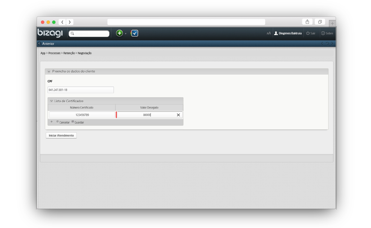
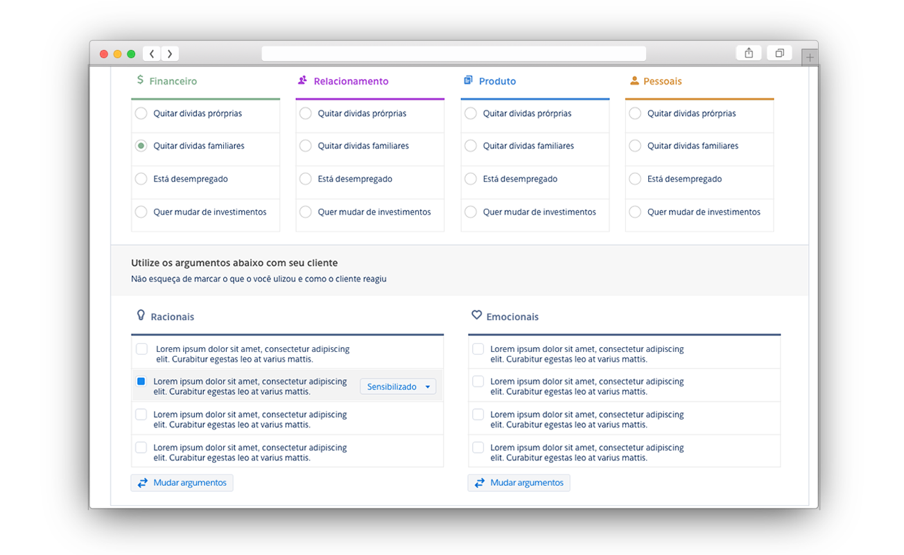
Testing ran throughout design and development, with the service built by our squad alongside Deloitte. These sessions validated features, information architecture, the CRM journey, and interaction detail.
The Bizagi prototype confirmed the new flow would improve how representatives engaged with clients. It also surfaced the result that surprised me most: in under ten days, representatives had internalized the new model. For a team being asked to change how they talk to customers — the core of their job — that's remarkably fast. It's the number that gave us confidence to ship.
Flyer used during the testing and implementation of the new CRM
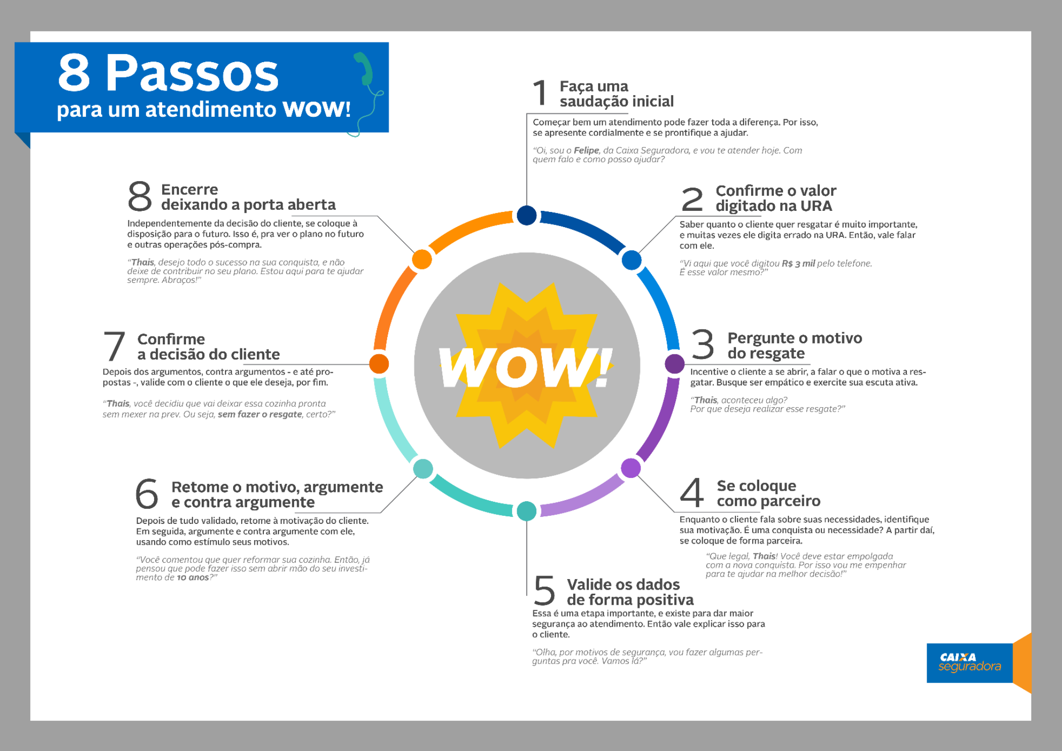
What shipped: the framework went into production in Salesforce, changing not just the internal tooling but how the retention team was trained and how they spoke with clients.
What I can measure: adoption. Under ten days to internalize a new service model, across a team whose daily work it rewrote. I moved on from Caixa Seguradora (and moved to North America) before longitudinal retention data was available, so I can't claim a final retention figure here. What I can speak to is what was built, what was adopted, and what it taught me.
On behavioural science: designers tend to treat biases and heuristics as an accessory to our own discipline. This project showed me how much wider their reach is — they're tools for understanding human behaviour anywhere it shows up, including in ourselves. Seeing them applied to a business process rather than an interface gave colleagues outside design a new lens on customer behaviour, and on the product decisions that follow from it.
On co-authorship: this is the lesson that stuck. We didn't study the representatives — they helped build the tool. That made the solution sharper during design, and it made adoption almost immediate afterwards. People adopt what they helped build, and they take pride in it.I've carried that into every project since. The people delivering a service aren't research subjects. They're co-authors.