2023 — 2024
RBC Borealis
Design lead
Every big thing starts small.
For Bank Assist, it started at a hackathon — a rough POC (proof of concept) called Leo that could summarize text, draft an email, or brainstorm ideas. The idea was simple: what if every employee had an AI partner at their side?
But in a bank the size of RBC, nothing stays simple for long.
We had to answer: How do you scale a generative AI tool across tens of thousands of employees, across dozens of business lines, while staying compliant, accessible, and actually useful?
RBC is first and foremost a bank — built on trust, compliance, and risk management.
But Borealis, the AI research arm, sees itself as a tech company. That means staying at the forefront of AI innovation and moving at the same pace as the technology itself.
This created a unique design challenge:
Enterprise scale vs. specificity
Could we build a tool that worked across the bank, while also serving highly specific use cases?
Speed vs. responsibility
How could we move quickly in releasing new features, without compromising on compliance, brand integrity, or user trust?
Productivity vs. experience
AI had to make employees more productive, but it also had to feel intuitive, human, and enjoyable to use.
Innovation vs. consistency
We wanted to push the limits of AI design, but also had to respect RBC’s internal guidelines, accessibility standards, and design system principles.
I was the design lead for the project, from the first proof-of-concept all the way through to multiple MVP releases.
My work included:
Rapid prototyping for feasibility tests
User research and usability testing
Extending RBC’s design system (spoken) for AI interactions
Designing accessibility-first elements and components
Working closely with product, development and engineering as we iterated through releases
The target definition was an essential step for the development of the Simulator and was done after compiling primary and secondary information from customers.
First, internal data from the BU was used to understand who were the major segment of clients. Who were they, what is their family configuration, amount of income, average contribution, and for how long are they investing in their private pension?
Then, open data from SUSEP and IBGE, both national agencies in Brazil respectively responsible for the private pension industry and the national Census. We wanted to understand the portrait of the Brazilians in need of the product faced to our current customers.
Finally, a focus group research was conducted with 4 groups of 10 people. Our goal was to understand general perceptions about the social security reform effects, perceptions about retirement and financial products.
With all the information collected, 3 targets were identified:

Aspiring for the retirement
Pain: will need to supplement his income.
Goal: maintain the same life standard in the future and retire with dignity.

The ones aiming for a future project
Pain: need to learn how to accumulate money.
Goal: accomplish a life achievement, such as their children's college, buying a house or an exchange.

Investors
Pain: don't know which funds are the best.
Goal: keep the investment in a profitable and reliable performance.
With the identification of the users, micro-journeys were drawn based on their pains and goals. This way, we could fit the product to the users' needs to create an experience that fit the briefing: without technicalities, instructive and accessible, customizable.
Although some factors may influence the decision making, such as life cycle, socio-cultural and behavioral factors, the research pointed to a common need: to understand the product and be able to interact with it. After all, a financial product only makes sense if it fits the person's lifestyle.
.png)
To quickly test and validate with stakeholders the proposed journey for the Simulator, some simple prototypes were made. It is worth noting that the experience, interactions and motions should be enjoyable since it was necessary to collect a high volume of information from users for the quote.
First designs were made on whiteboards, paper and pen. Then internal tests were done with Typeforms, emulating the interaction. Later, prototypes were developed using Axure to dig deeper into interactions and functionality for both desktop and responsive versions. And finally, the UI was designed using Adobe XD, prioritizing aesthetics and visual design.
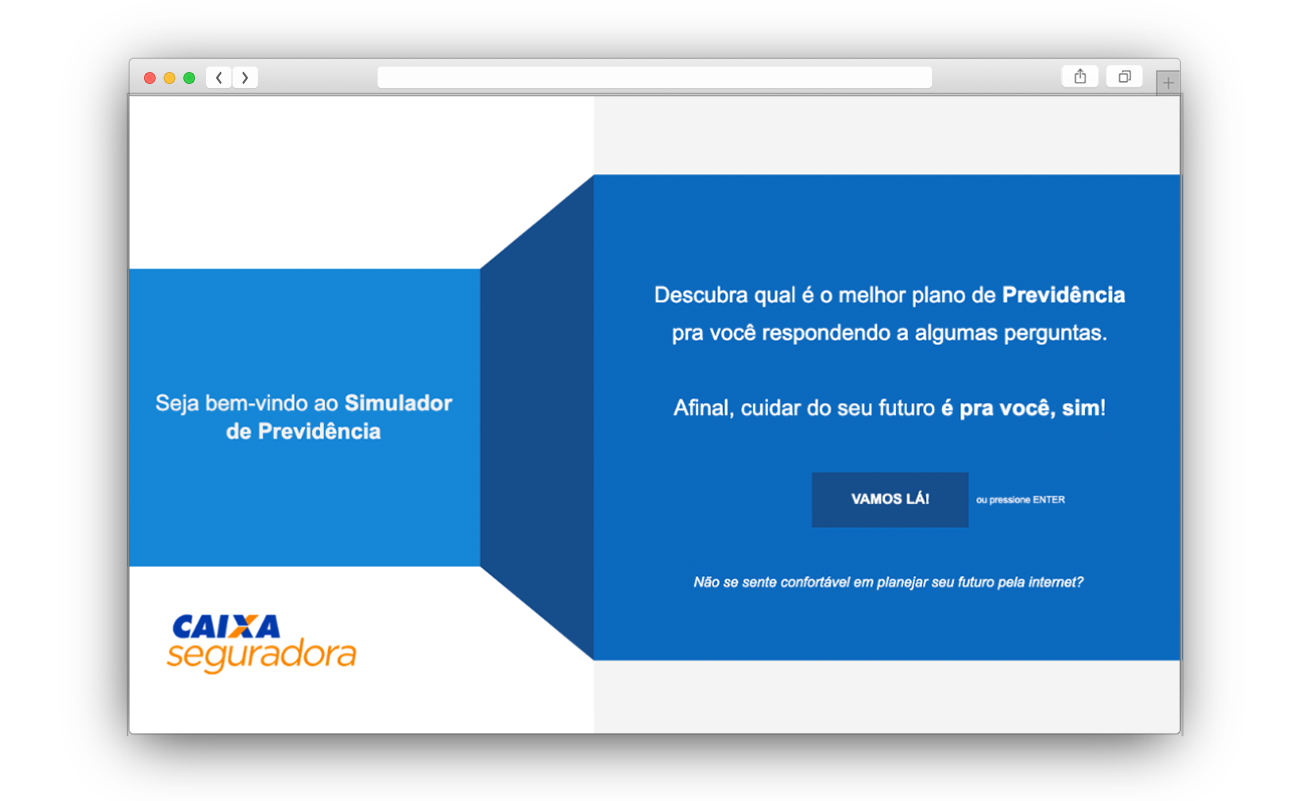
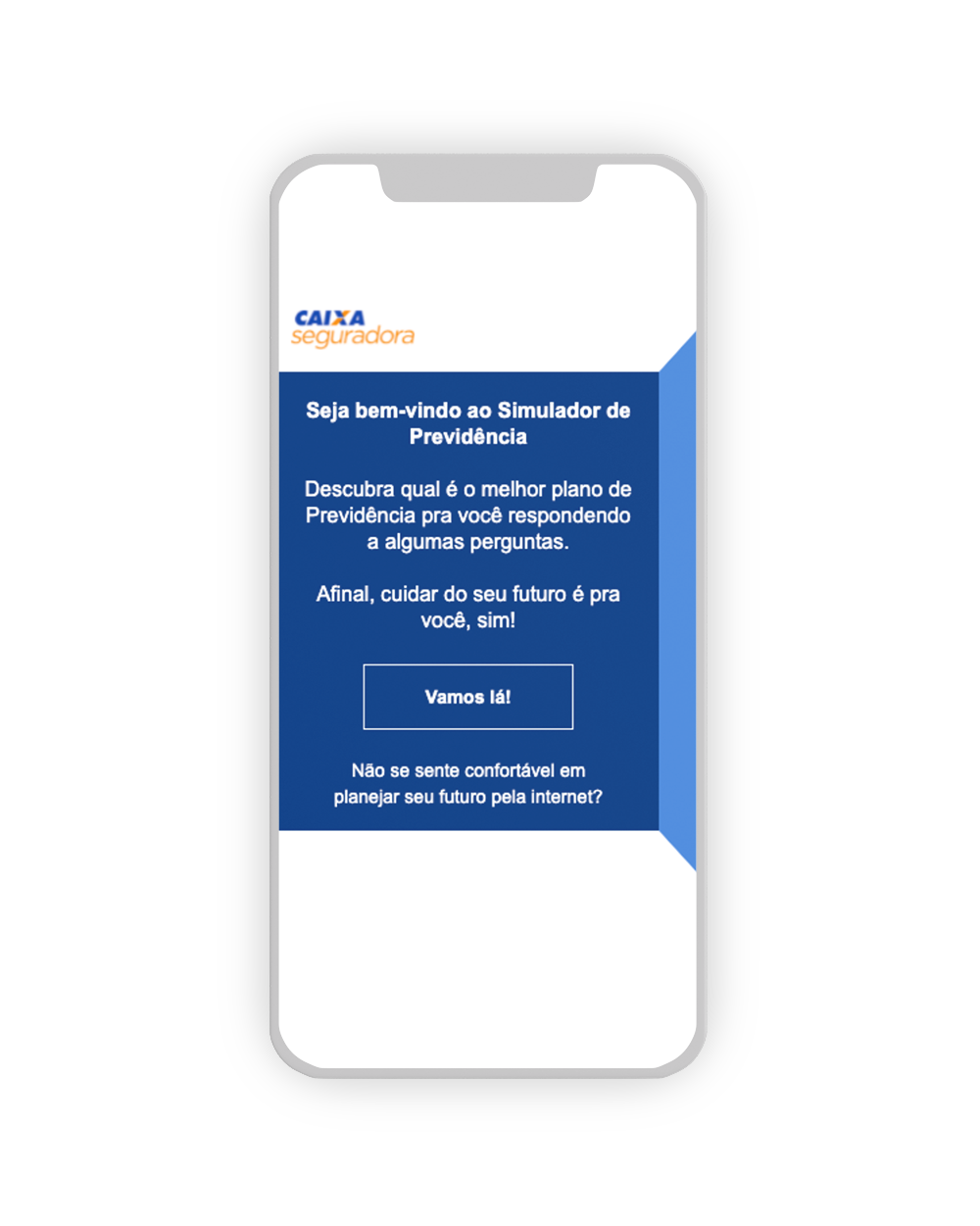
With each new version made of the wireframe, small usability tests were performed with the internal audience - Caixa Seguradora employees who fit the user profiles and no product knowledge. So, then, a total of 3 waves of tests were made with improvement points both in the designed journey and in interactions.
As a result, we understood that the users wanted something more instructive, but without going through too many product particularities. Because of this, the team decided to remove some features from the simulator and the product, such as inserting coverage, benefits, and even some specific products.
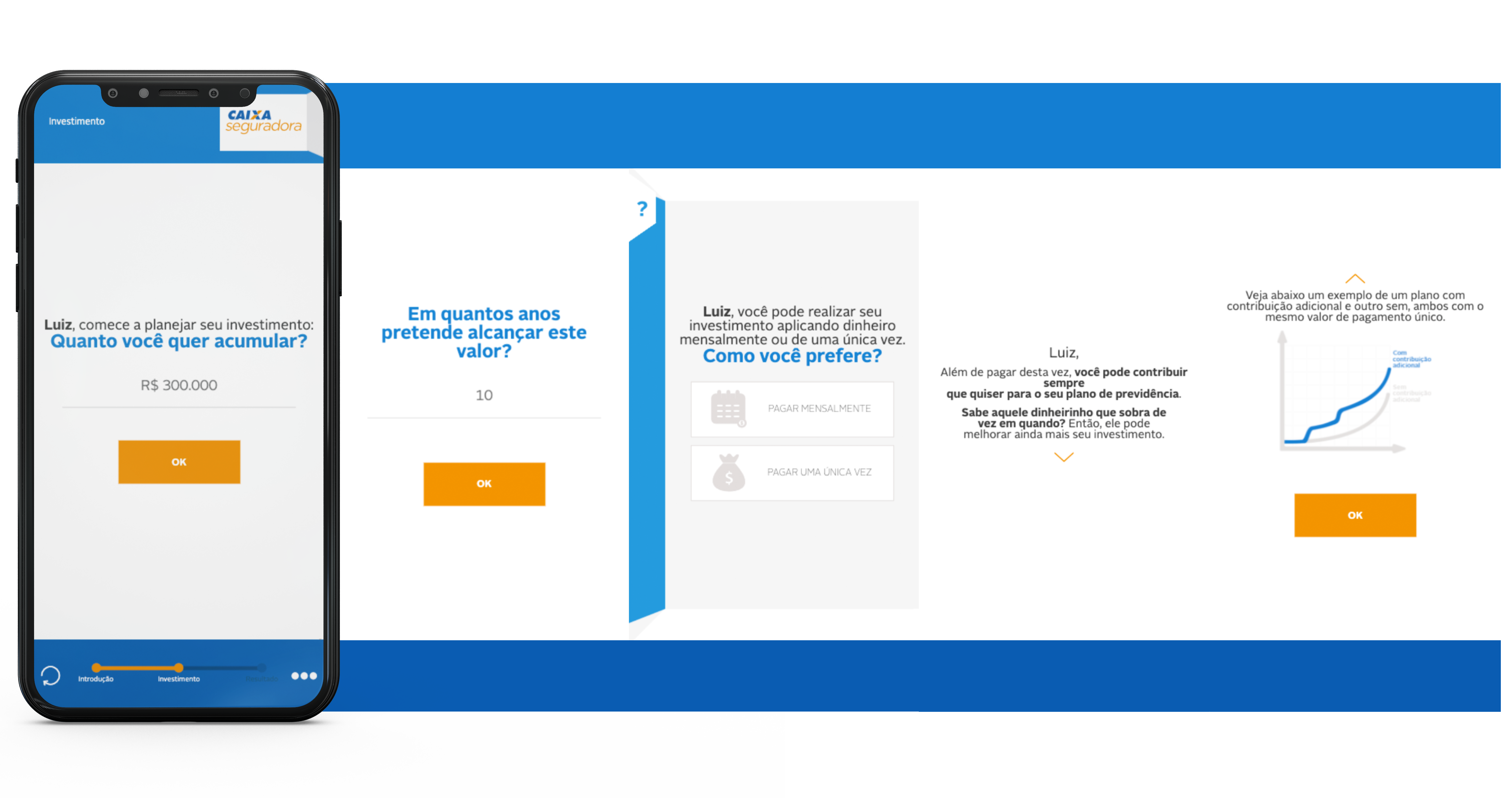
As a result, the Private Pension Simulator of Caixa Seguradora was recurrently used in digital campaigns, from national to even sporadic advertising. The volume of traffic in the product page also increased considerably, including by reference, since Caixa Econômica Federal, one of the majority shareholders of Caixa Seguradora and Brazil's largest bank, also placed the Simulator on its website.
As a learning experience, especially because it was my first UX and Design System project, the importance of thinking big but starting small remains. It is important to contain your enthusiasm and focus on delivering an MVP - improvements will come later.

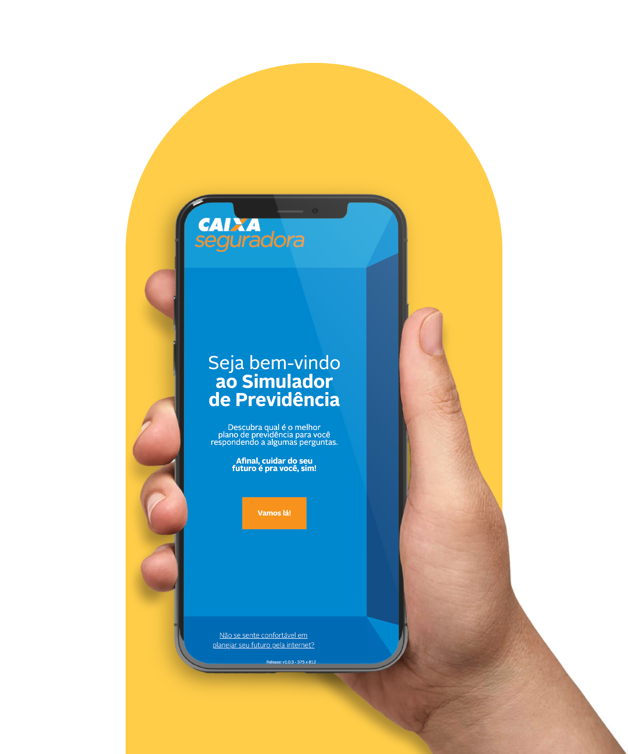
Final version
The Private Pension Simulator from Caixa Seguradora has a new version, but can be accessed through the link below.
Click here ↓